Streamline Design System
The Streamline Design System was conceived to unify and standardize our product’s look and feel across multiple platforms. Recognizing inconsistencies and inefficiencies in our existing design patterns, I proposed and led an initiative to create a shared library of components, guidelines, and best practices. Although we had no direct user feedback at this stage, the system set a solid foundation for future product development.

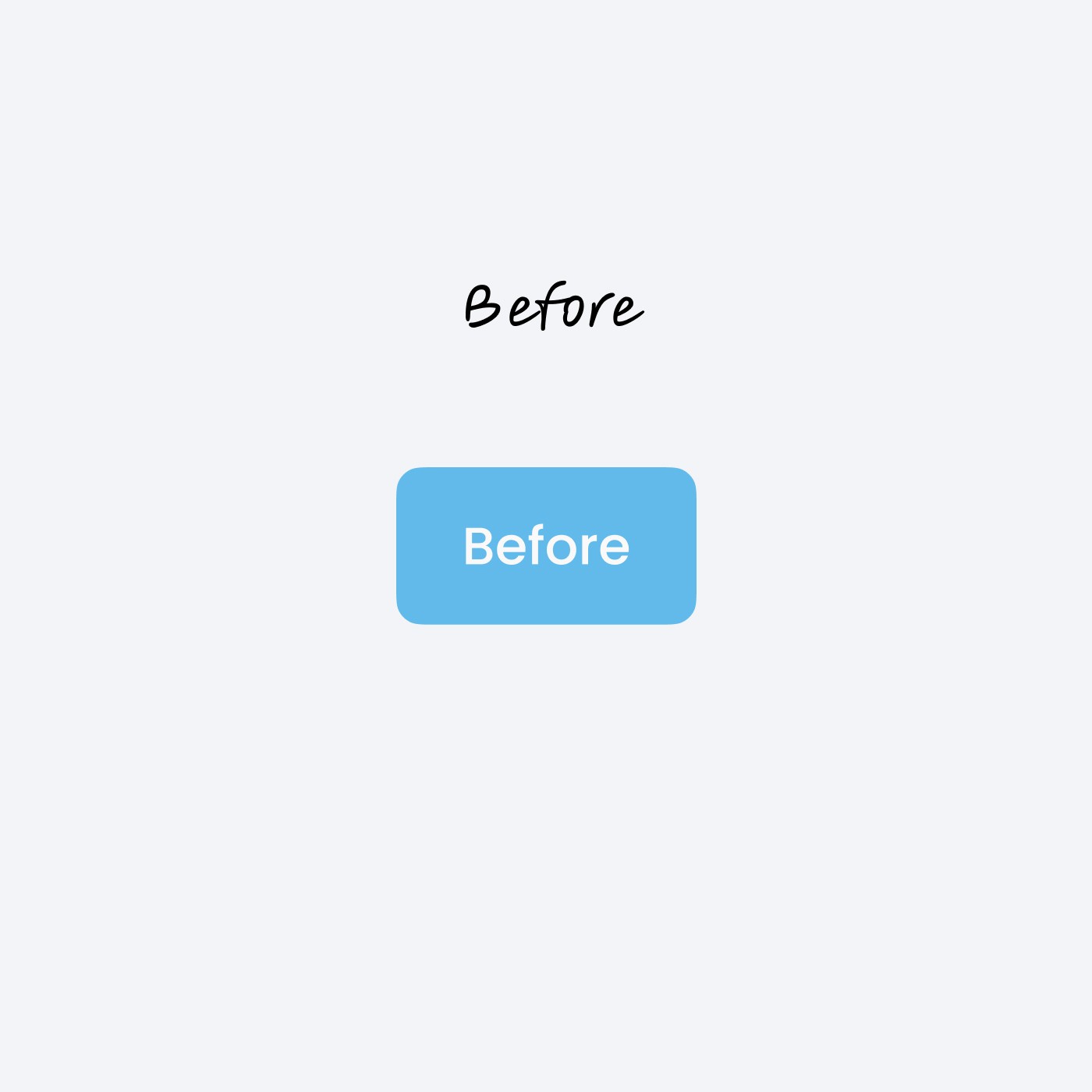
Before Streamline, individual product teams often implemented their own styles, creating inconsistent experiences and duplicative efforts. Our design and development processes suffered from:
Multiple, conflicting UI patterns.
Slower production timelines due to “reinventing the wheel.”
Difficulty maintaining brand integrity across touchpoints.

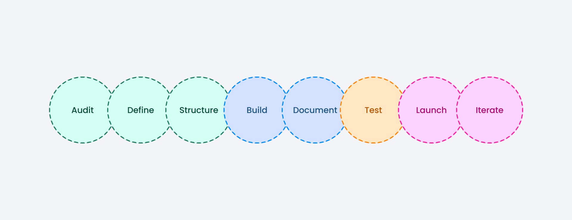
I served as the UX/UI designer and key advocate for a unified design system. My responsibilities included:
Pitching the concept to leadership, outlining the long-term ROI of consistent design.
Defining component guidelines and UI patterns in collaboration with the Systems Architect, Front-End, and Back-End teams.
Establishing a scalable structure for future expansions and integrations.


I worked closely with:
Systems Architecture to ensure each component’s structure fit within our overall tech stack.
Front-End to develop reusable component libraries (React, Vue, or Angular-based, whichever is relevant).
Back-End to align on naming conventions and data-handling guidelines, ensuring consistent API-driven states for components.

Although no direct end-user testing took place yet, the Streamline Design System provided:
Immediate internal alignment—teams began using unified components, speeding up design and development.
Consistent brand experience across different product modules.
A clear roadmap for future iterations and expansions once user feedback becomes available.
By creating the Streamline Design System ahead of large-scale user adoption, we established a strong foundation for future product growth. Next steps include:
Gathering real-world feedback as new features roll out.
Refining and expanding the system based on user needs and evolving brand standards.
Ongoing collaboration with all teams to ensure continuous updates and consistency.
Demonstrated initiative in identifying and solving brand and UI inconsistencies proactively.
Skilled at cross-functional coordination—ensuring designs translate efficiently into code.
Created a scalable, modular library of components that can evolve with product strategy.
Laid the groundwork for a consistent user experience, even before end-user testing commenced.