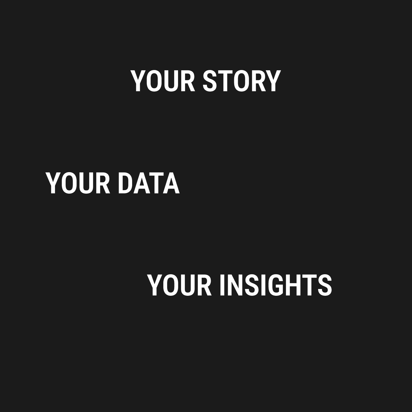
Personalized Data Insights
As part of the larger Lotic ecosystem, Insights provides users with a streamlined view of key metrics and actionable trends derived from personal stories and AI-driven data. My role was to ensure this feature integrated seamlessly with the rest of Lotic, while maintaining clarity and ease of use.

Users needed a clear way to interpret their data and progress within Lotic. Without a dedicated Insights feature, they had difficulty identifying patterns or taking meaningful action on the platform. This tool was designed to condense multiple data points into easy-to-understand visualizations, helping them see their mental wellness journey more holistically.
As the UX/UI and visual designer, I collaborated with engineers, data scientists, and clinical experts to:
Map user flows for accessing Insights within the broader Lotic platform.
Design data visualizations that aligned with Lotic’s empathetic approach.
Conduct lightweight user testing and iterate on dashboard layouts to ensure consistency with the overall Lotic experience.
User interviews revealed a desire for:
Simplified, at-a-glance metrics that connected personal stories to tangible insights.
Consistency with Lotic’s existing look, feel, and voice.
Real-time or frequent updates reflecting changes in mental wellness over time.

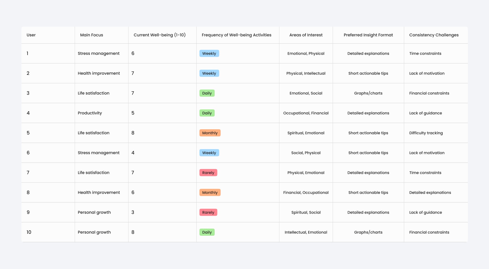
Within Lotic, we identified two main user types for Insights:
The Quick Checker: Wants a fast overview of their mental wellness trends.
The Deep Diver: Looks for in-depth analysis tied to personal stories and AI-driven suggestions.
A typical journey: Log into Lotic → Select Insights → Review data visualizations → Adjust filters or dive deeper → Take action or reflect.

We brainstormed ways to present personal narratives and AI-derived metrics side by side. Key focuses:
A consistent top-level navigation to switch between Lotic’s main functionalities and Insights.
Clear modules or cards for each data category, tying back to user stories.
A friendly, empathetic tone consistent with Lotic’s overall brand.

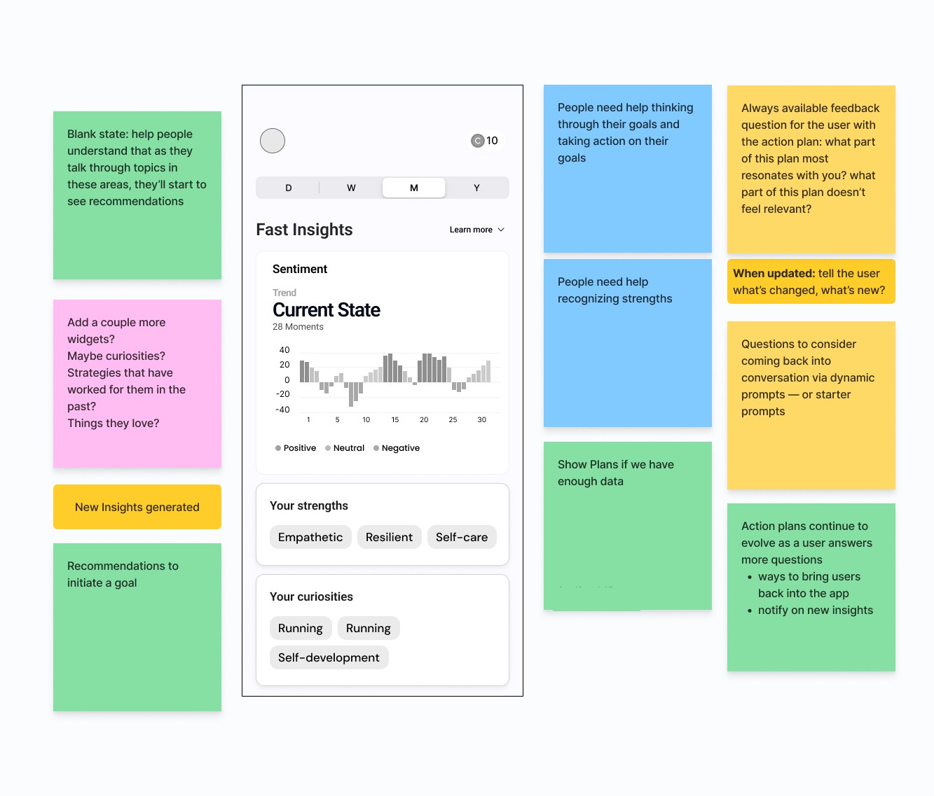
I developed high-fidelity mockups aligning with Lotic’s existing color palette and typography. Focus areas:
Data cards that highlight key takeaways without overwhelming.
Tooltips offering short, plain-language explanations of AI-driven stats.
A subtle transition from Lotic’s main feed to the Insights dashboard.

Early tests revealed:
Users wanted more direct comparisons between personal stories and data trends.
Additional clarity on how AI processed their data.
A quick-save or export function to share insights with therapists or coaches.
We refined labels, added more narrative hooks, and introduced a simple export feature.

Insights became a central feature within Lotic, offering:
Seamless integration of personal stories and AI-driven metrics.
Visual clarity that encouraged consistent user engagement.
Data-backed decision-making for users and clinicians alike.

Designing Insights taught me how to translate raw data into meaningful stories within a well-being context. Future steps include:
Deeper personalization, connecting more user stories to specific data patterns.
Expansion of data sources for broader insights.
Continued usability testing to maintain a user-first design approach across Lotic.
Strength in integrating new features (Insights) into an established platform.
User-centric approach balancing data visualization, branding, and privacy.
Effective collaboration across design, data science, and clinical teams.
Commitment to iterative testing, ensuring a refined, impactful user experience.